A Beginner’s Guide to Website Accessibility

A guide to help content managers implement and maintain website accessibility standards.

Core Accessibility Principles (POUR)

Headings

  • A page should only contain a single H1. This is typically the page title and part of the page template. It should be descriptive and informative.
  • Avoid duplicating headings (e.g., “More Details”). Headings should provide context about the content it belongs to.
  • Headings should follow proper structure. Here’s an example:

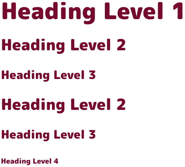
Good Heading Structure

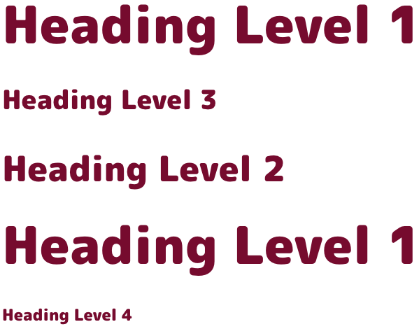
Bad Heading Structure

Text

  • Avoid the use of All Caps. Screen readers may treat this as an acronym. Full capitalization also reduces readability because all of the words have a uniform rectangular shape, meaning readers can’t identify words by their shape. If you still wish to use all caps on your site, your developer can create this style for you to ensure it’s accessible with assistive devices.
  • Use legible font sizes. 12 points / 16 pixels is the standard minimum size for body copy.
  • Text colour should be high contrast. Text and images of text must have a contrast ratio of at least 4.5:1. Large text – at least 18 point (typically 24px) or 14 point (typically 18.66px) and bold – must have a contrast ratio of at least 3:1.

    Check colour contrast using the WebAIM Contrast Checker.

Images of Text

  • Be cautious about using images of text. If the same visual presentation can be made using text alone, an image should not be used to present that text.
  • Text colour should be high contrast. Images of text should have a contrast ratio of at least 4.5:1. Large text – at least 18 point (typically 24px) or 14 point (typically 18.66px) and bold – should have a contrast ratio of at least 3:1.
  • Don’t use “click here”. Not everyone will be clicking, therefore link text should not focus on the mechanics of the link.
  • Links should be distinguishable. Avoid vague link text like “learn more” or “read more”*. Link text should explain what it offers and make sense if read out of context.

*There is an exception to the “read more” rule but it requires a web developer to make sure the link is properly coded. This means that assistive technology users hear a description of the link in the code while the text on the page (in context) still shows as ‘read more’.

Images

  • Alt tag images that convey content. Images should have appropriate, equivalent alternative text.
  • Do not alt tag images that don’t convey content. Images that are decorative, or contain content that is already conveyed in text should not be alt tagged.
  • Provide alternative for complex images. Equivalent alternatives to complex images should be provided in context or on a separate linked page.

Example

Stack of pancakes with blueberries and maple syrup

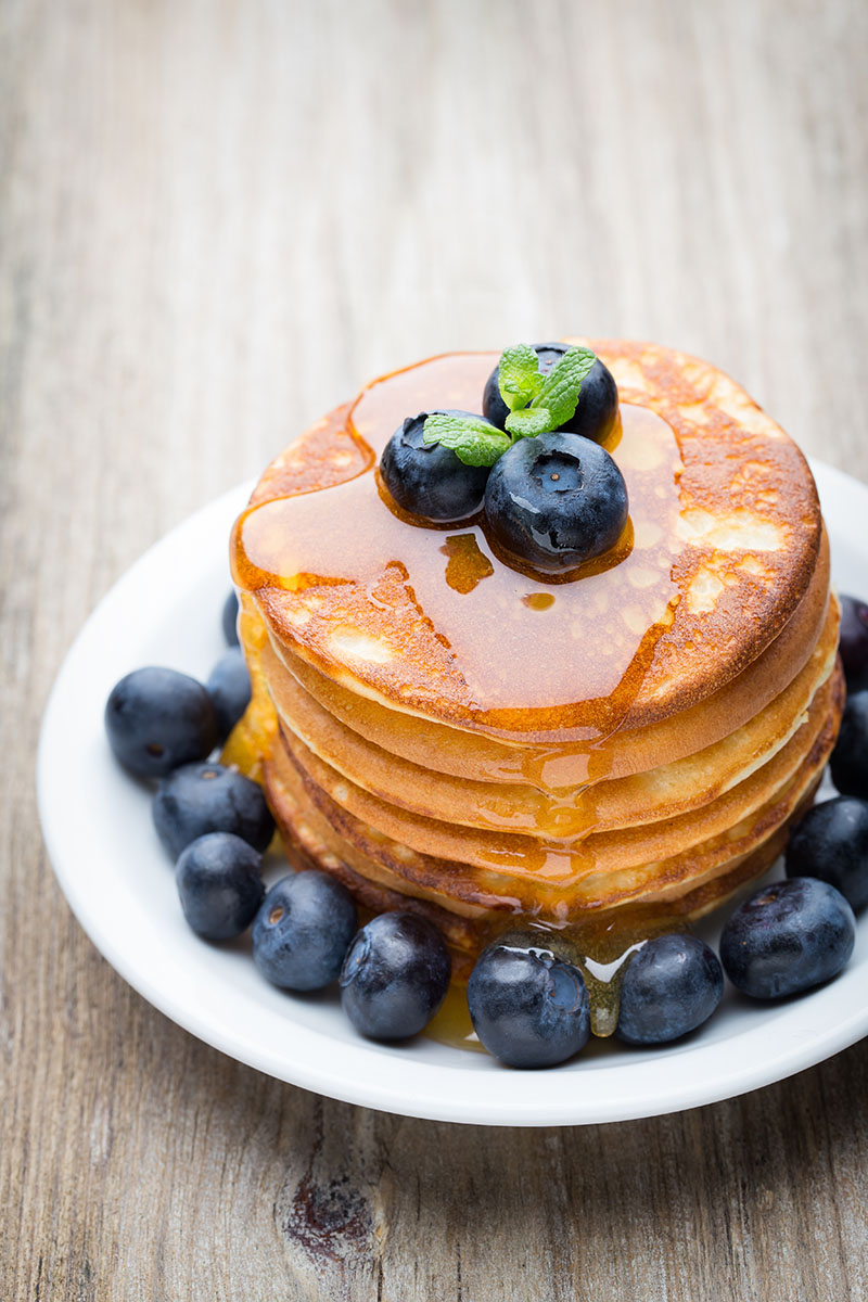
Okay: Alt=”Pancakes”

This alt text is only “okay” because it’s not very descriptive. Yes, this is an image of a stack of pancakes. But, there’s more to be said about this image.

Good: Alt=”Stack of pancakes with blueberries and maple syrup”

This alt text is a better alternative because it is far more descriptive of what’s in the image. This isn’t just a stack of “pancakes” (as the first alt text example demonstrated); it’s a stack of blueberry pancakes with a dusting of powdered sugar!

Not recommended: Alt=”Photo of pancakes”

or

Alt=”pancake pancakes hotcake hotcakes breakfast best breakfast food pancake recipe”

Neither of these examples are recommended. The first alt tag doesn’t need to include “photo of”, the screen-reading tool will identify it as an image. The second example demonstrates keyword stuffing in alt text, this should also be avoided.

Documents

  • Avoid or minimize the use of documents. Wherever possible, create web content and avoid the use of documents like PDFs as a sole source of information.
  • PDFs can be difficult to view on small screen sizes, may be slow to download due to file size, and are often not created to be accessible for those using assistive devices.